

Silent Stars, Superheroes and Scandinavian Style
From Silent Screens to Stålmannen: The Art of Swedish Film Posters
Before Swedish design became shorthand for pale timber, clean lines and tasteful restraint, its cinema posters were doing something much louder.
Electric colour. Hand-drawn lettering. Movie stars transformed into graphic icons. Imported films reimagined rather than merely translated. From the fragile glamour of silent cinema to the comic-book force of Superman, Swedish film posters developed a visual language with real nerve.
What makes them especially collectible is the sense of artistic freedom. Swedish distributors frequently commissioned local artwork for foreign films, allowing illustrators and graphic artists to interpret the mood of a picture instead of simply reproducing an American or British campaign. Hollywood glamour went into the machine; something distinctly Scandinavian came out.
When cinema advertising was still being invented
The earliest Swedish film posters belong to an exciting and precarious moment. Cinema was young, the language of screen advertising was still being worked out and posters were temporary working objects rather than future collectibles. They were pinned up, pasted down, folded, handled and usually discarded when a film left town.
That makes surviving silent-era examples extraordinarily evocative. In some cases, the film itself has disappeared while the poster remains: a single sheet of printed paper carrying the colours, stars and atmosphere of an otherwise vanished production.
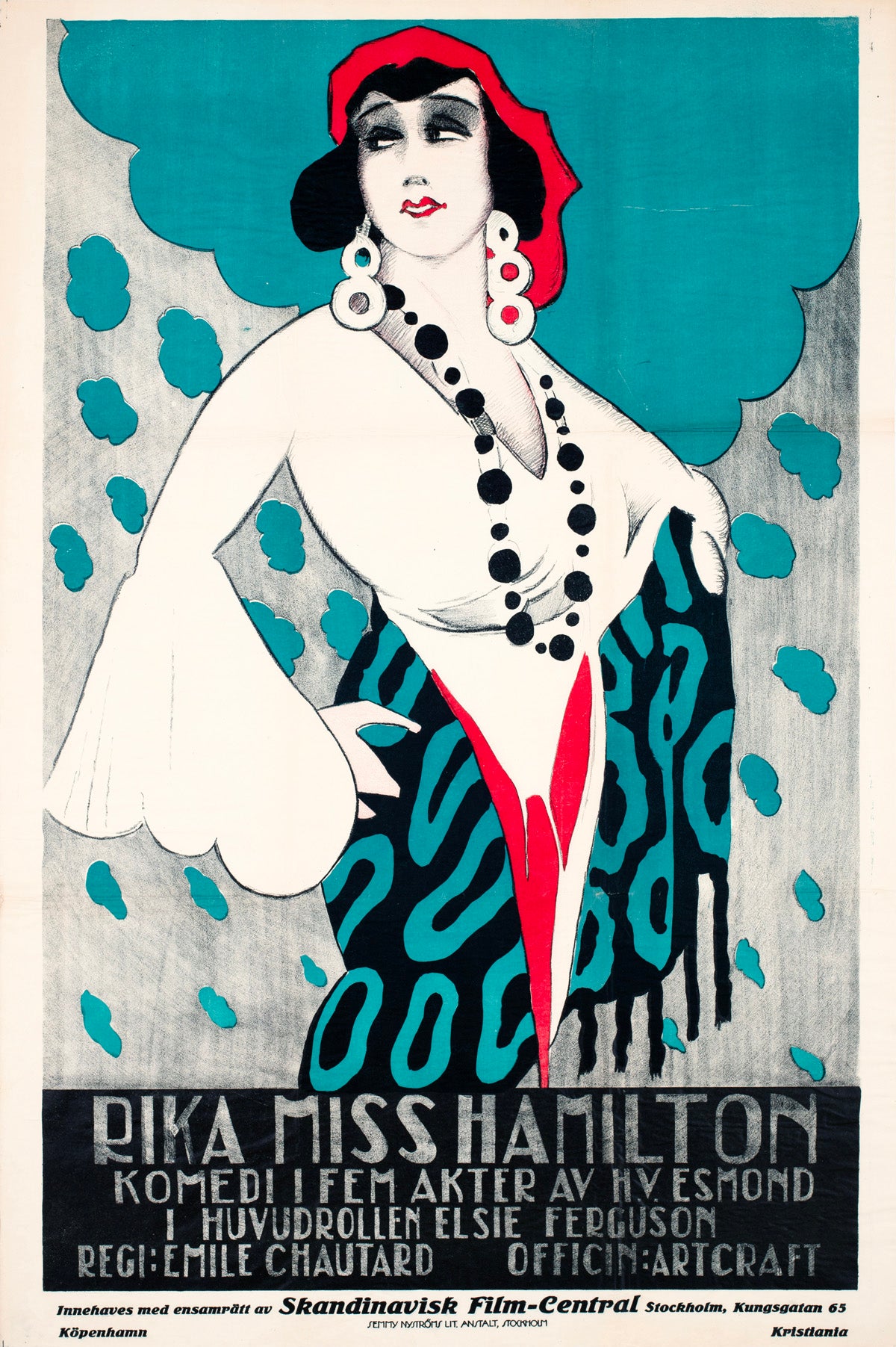
Under the Greenwood Tree, known in Sweden as Rika Miss Hamilton, was a 1918 American silent drama directed by Émile Chautard and starring Elsie Ferguson. The film is now considered lost, giving its surviving Swedish poster an added charge.
The design is pure Jazz Age theatre. Ferguson appears as a fashionable modern woman surrounded by turquoise, black and flashes of red. Her jewellery becomes a chain of graphic circles; her clothes almost dissolve into pattern. It feels less like a conventional film advertisement than an illustration from an impossibly stylish magazine.
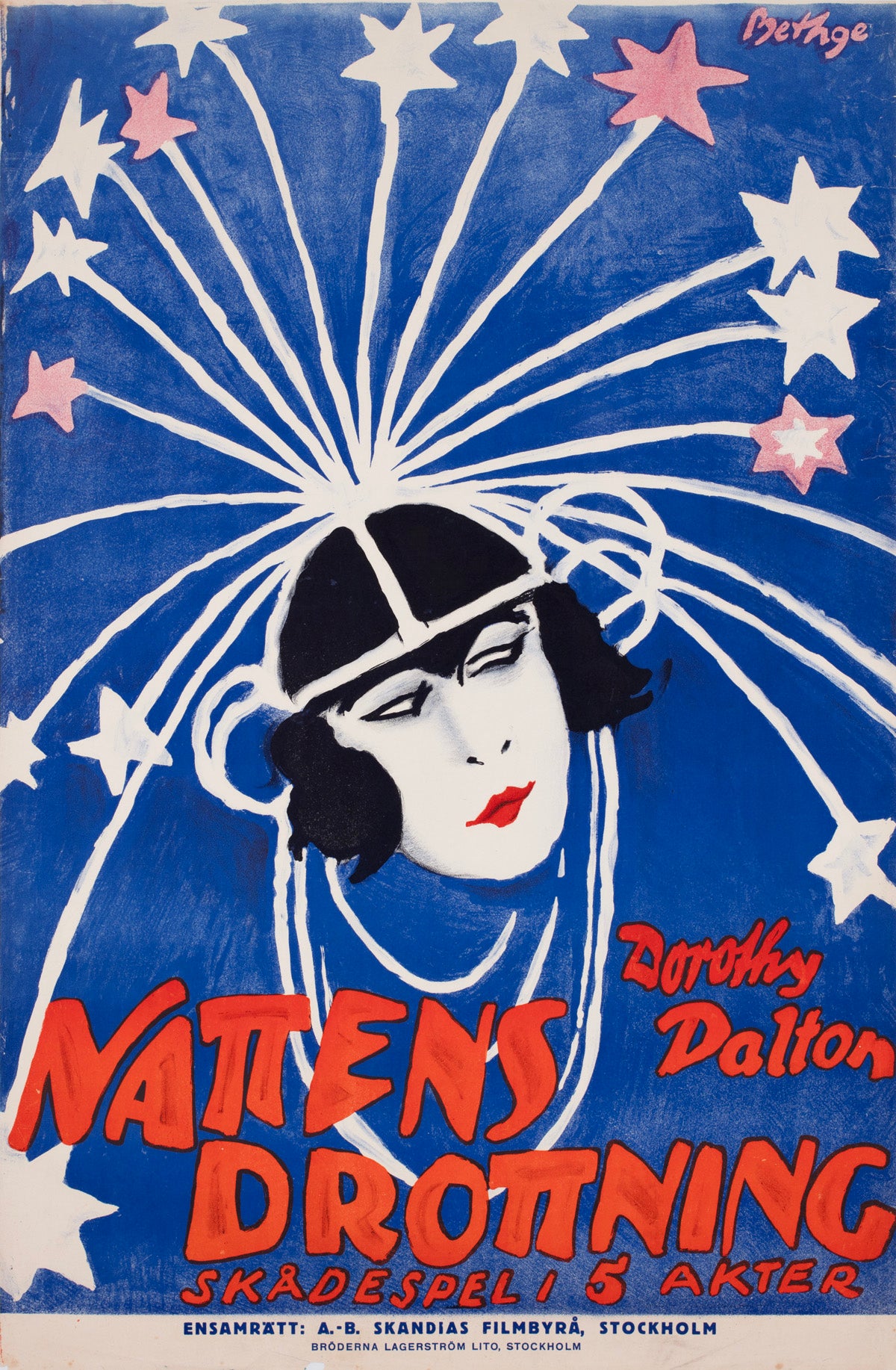
Rolf Bethge’s Queen of the Night is quieter but even more mysterious. American star Dorothy Dalton floats against a field of deep blue as white and pink stars explode from her headpiece. A pale face, black hair and one sharp stroke of red lipstick do almost all the work.
The image sits between theatrical portraiture and early Art Deco. There is no crowded montage and almost no attempt to explain the plot. Bethge sells a sensation instead: night, beauty, celebrity and spectacle. More than a century later, it still feels modern.
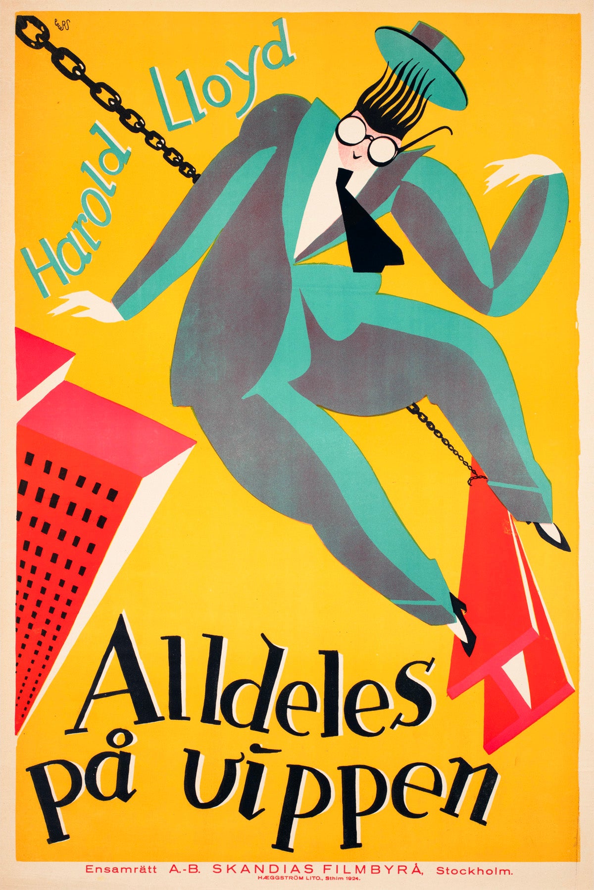
Curt Peters takes the opposite route in his sensational 1924 Swedish design for Harold Lloyd’s Safety Last!, released locally as Alldeles på vippen.
Lloyd perches precariously on a steel girder of the kind used in skyscraper construction, apparently suspended high above the city. The mustard-yellow ground, turquoise suit and sharply angled coral-red buildings turn the danger and vertigo of the film’s famous climbing sequence into pure modernist design. Fast, funny and beautifully economical, it reduces an entire skyscraper comedy to one perfect graphic gag.
Colour with a job to do
The limited palettes of many early Swedish posters were partly aesthetic and partly practical. Early colour lithography required separate stones or plates and individual printing passes for different inks. Swedish silent-era film advertising also included striking two- and three-colour linocuts, a process naturally suited to flat shapes, bold outlines and simplified forms.
Restriction became style. Turquoise sits against black. A single red accent pulls the eye towards a mouth or title. Yellow turns a background into a spotlight. Lettering is not placed politely beneath the artwork; it bends, tilts and collides with it.
These colours were chosen to work at a distance, outside a cinema or across a busy street. They still work across a room.
As printing technology developed, offset lithography and photomechanical reproduction made photographic imagery, tonal shading and larger commercial print runs increasingly practical. Swedish poster designers embraced those possibilities without abandoning illustration. Photography could be cropped, painted over, surrounded by colour or combined with hand-drawn lettering until the familiar became new again.
Eric Rohman: maximum cinema, minimum fuss
No history of Swedish film posters gets far without Eric Rohman.
Born in 1891, Rohman became one of the remarkably few Swedish artists able to make a living principally from poster design. His own estimate placed his lifetime output at more than 7,000 posters. The number sounds almost impossible, but it helps explain the speed and confidence of his best work.
Rohman knew how to find the image that mattered: a face, a gesture, a silhouette or a visual gag. Everything unnecessary could go. His posters are often economical without feeling cold, commercial without becoming anonymous. He understood that a cinema poster had seconds to seduce its audience.
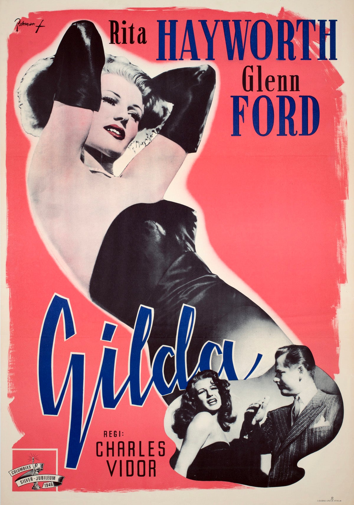
His Swedish poster for Gilda is a masterclass in star power. Rita Hayworth stretches across an enormous coral-pink field in black satin and opera gloves, while the title cuts diagonally through the composition in deep blue. A smaller vignette of Hayworth and Glenn Ford gives us the drama; the giant reclining figure gives us the reason to buy a ticket.
It is photography treated as graphic material rather than documentary evidence. Scale is distorted, colour is theatrical and typography becomes part of Hayworth’s performance. The result is unmistakably Gilda, but unmistakably Rohman too.
Elsewhere in our Swedish collection, his range runs from the rare silent drama The Hungry Heart to Laurel and Hardy, The Great Dictator and the shadowy noir of Dead Reckoning. Different films, same instinct for the killer image.
Gösta Åberg: the great shape-shifter
Gösta Åberg, born in Stockholm in 1905, was a poster artist, graphic designer and visual artist whose film work ran to thousands of designs. Where Rohman could be sharply economical, Åberg was a brilliant shape-shifter. He moved between painted portraiture, romance, adventure, noir, comedy, war, animation and modern pop graphics without losing his own sense of composition.
An Åberg poster rarely feels like studio artwork with Swedish words added afterwards. He interpreted films. Stromboli becomes elemental and volcanic. Limelight becomes melancholy theatre. La Perla becomes sun, sea and fate. Goldfinger becomes icy 1960s glamour.

Then there is Superman.
Created as a Swedish stock one-sheet for programmes featuring Paramount’s Max Fleischer colour cartoons, the poster presents the hero under his Swedish name: Stålmannen, literally “The Man of Steel”.
Åberg gives him a teal-green costume, a scarlet cape and an electric yellow outline against a near-black ground. The title races diagonally across the sheet while streaks of white suggest speed, flight and scratched animation cells. The whole composition feels like one giant comic-book panel blown apart.
It predates Pop Art but seems to anticipate it: hard outlines, commercial colour, repetition, mass-media mythology and a superhero turned into a monumental graphic symbol. As both an early piece of superhero cinema history and a major Swedish poster design, it is exceptionally rare.
From painted stars to pop culture
Swedish film poster design continued to evolve through the 1950s, 1960s and 1970s. Photography became more prominent. International campaign art travelled more easily. Modernism, Pop Art and changing cinema audiences pushed layouts towards sharper typography, montage and more experimental colour.
Yet the variety remained. Our collection moves from Ingrid Bergman, Charlie Chaplin and Marilyn Monroe to James Bond, The Beatles, Fellini, Stanley Kubrick, Hammer horror and Steven Spielberg. It includes the psychedelic world of Yellow Submarine, the cool modernity of Blow-Up, the cosmic scale of 2001: A Space Odyssey and Hans Arnold’s wonderfully dark designs for Horror of Dracula and Duel.
The strongest Swedish posters do something collectors love: they make famous films unfamiliar again. A movie seen a hundred times can suddenly have a new face, a new colour palette and a completely different emotional temperature.
Why Swedish film posters hit differently
They sit in a sweet spot between commercial cinema and independent graphic art.
They are recognisable without being predictable. Beautifully made without becoming polite. Scandinavian, certainly, but often far stranger, warmer and more expressive than the clichés of Scandinavian design suggest.
The early pieces preserve a world of silent stars and lost films. Rohman and Åberg show what happens when prolific commercial artists are also brilliant image-makers. The later posters capture cinema colliding with photography, modernism, Pop Art and international youth culture.
Together, they form a visual history of the movies as seen from Sweden: romantic, dramatic, witty, stylish and occasionally completely wild.
Explore our full collection of original Swedish film posters.
Suggested Reading
- Shop Original Vintage Swedish Film Posters
- When Germany Split the Screen: West & East German Film Poster Design
- The Polish School of Posters: Masters of Bold and Avant-Garde Design
- Icons in Ink: How Comic Book Art Shaped the World of Superheroes
- Authenticating Vintage Film Posters: Collector’s Guide